Seaborn 과 Bokeh 는 파이썬에서 이용할 수 있는 plotting 도구들이지만, 둘은 각자 지향하는 목적이 다르며 서로가 더 적합한 상황도 다릅니다. 데이터 분석 결과의 시각화 목적에서 두 패키지가 지원하는 기능을 비교해 봄으로써 각자가 할 수 있는 일과 할 수 없는 일을 알아봅니다. 또한 이 튜토리얼은 두 패키지의 사용법을 빠르게 익히려는 목적에 제작하였습니다. Part 1 은 seaborn 의 사용법이며, official tutorial 를 바탕으로, 알아두면 유용한 이야기들을 추가하고 중복되어 긴 이야기들을 제거하였습니다.
Plotting with numerical data
Python 으로 plot 을 그릴 때 가장 먼저 생각나는 도구는 matplotlib 입니다. 가장 오래된 패키지이며, 아마도 현재까지는 가장 널리 이용되고 있는 패키지라 생각됩니다. 하지만 matplotlib 은 그 문법이 복잡하고 arguments 이름들이 직관적이지 않아 그림을 그릴때마다 메뉴얼을 찾게 됩니다. 그리고 매번 그림을 그릴 때마다 몇 줄의 코드를 반복하여 작성하게 됩니다. Seaborn 은 이러한 과정을 미리 정리해둔, matplotlib 을 이용하는 high-level plotting package 입니다.
이 튜토리얼은 Seaborn=0.9.0 의 official tutorial 을 바탕으로, 추가적으로 알아두면 유용한 몇 가지 설명들을 더하였습니다. 기본적인 흐름과 예시는 official tutorials 을 참고하였습니다.
import numpy as np
import pandas as pd
import matplotlib.pyplot as plt
import seaborn as sns
Seaborn 은 Pandas 와 궁합이 좋습니다. Pandas.DataFrame 의 plot 함수는 기본값으로 matplotlib 을 이용합니다. 그리고 seaborn 은 DataFrame 을 입력받아 plot 을 그릴 수 있도록 구현되어 있습니다. Seaborn 에서 제공하는 tips 데이터를 이용하여 몇 가지 plots 을 그려봅니다.
tips = sns.load_dataset("tips")
tips.head(5)
| total_bill | tip | sex | smoker | day | time | size | |
|---|---|---|---|---|---|---|---|
| 0 | 16.99 | 1.01 | Female | No | Sun | Dinner | 2 |
| 1 | 10.34 | 1.66 | Male | No | Sun | Dinner | 3 |
| 2 | 21.01 | 3.50 | Male | No | Sun | Dinner | 3 |
| 3 | 23.68 | 3.31 | Male | No | Sun | Dinner | 2 |
| 4 | 24.59 | 3.61 | Female | No | Sun | Dinner | 4 |
Scatter plots
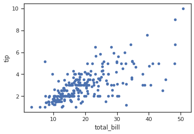
두 변수 간의 관계를 살펴볼 수 있는 대표적인 plots 으로는 scatter plot 과 line plot 이 있습니다. 우선 scatter plot 을 그리는 연습을 통하여 seaborn 의 기본적인 문법을 익혀봅니다.
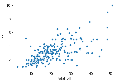
seaborn.scatterplot() 에 tips 데이터를 이용한다는 의미로 data=tips 를 입력합니다. 이 중 x 로 ‘total_bill’ 을, y 로 ‘tip’ 을 이용하겠다고 입력합니다. 그러면 그림이 그려집니다.
sns.scatterplot(x="total_bill", y="tip", data=tips)
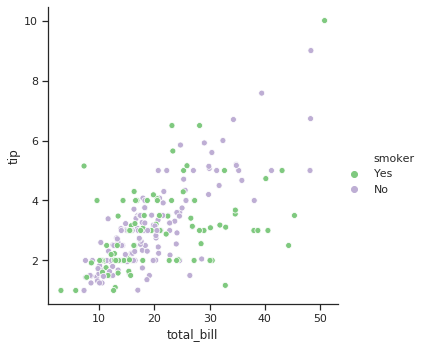
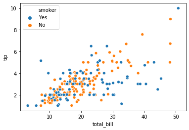
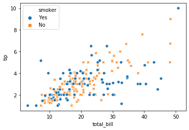
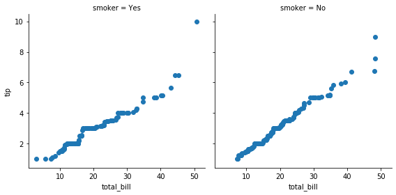
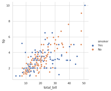
흡연 유무에 따라 서로 다른 색을 칠할 수도 있습니다. 이는 hue 에 어떤 변수를 기준으로 다른 색을 칠할 것인지 입력하면 됩니다.
sns.scatterplot(x="total_bill", y="tip", hue="smoker", data=tips)
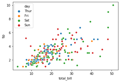
해당 변수값의 종류가 다양할 경우 각 종류별로 서로 다른 색이 칠해집니다.
sns.scatterplot(x="total_bill", y="tip", hue="day", data=tips)
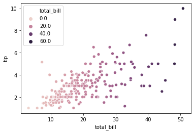
hue 에 입력되는 값이 명목형이 아닌 실수형일 경우, 그라데이션 형식으로 색을 입력해줍니다.
sns.scatterplot(x="total_bill", y="tip", hue="total_bill", data=tips)
Marker style 도 변경이 가능합니다. style 에 변수 이름을 입력하면 해당 변수 별로 서로 다른 markers 를 이용합니다. 이후 seaborn 의 style 에 대하여 알아볼텐데, scatterplot() 에서의 style argument 는 marker style 을 의미합니다.
sns.scatterplot(x="total_bill", y="tip", hue="smoker", style="smoker", data=tips)
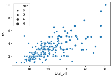
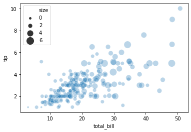
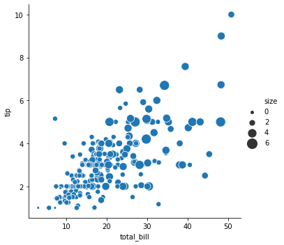
Marker 의 크기도 조절이 가능합니다.
sns.scatterplot(x="total_bill", y="tip", size="size", data=tips)
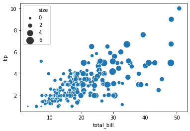
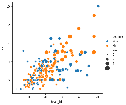
또한 marker 크기의 상한과 하한도 설정할 수 있습니다.
sns.scatterplot(x="total_bill", y="tip", size="size", sizes=(15, 200), data=tips)
alpha 는 투명도입니다 (0, 1] 사이의 값을 입력합니다.
sns.scatterplot(x="total_bill", y="tip", size="size",
    sizes=(15, 200), alpha=.3, data=tips)
relplot() vs scatterplot()
그리고 official tutorial 에서는 seaborn.relplot() 함수를 이용하여 이를 그릴 수 있다고 설명합니다. 그런데, 그 아래에 relplot() 은 FacetGrid 와 scatterplot() 과 lineplot() 의 혼합이라는 설명이 있습니다. 아직 우리가 한 번에 여러 장의 plots 을 그리는 일이 없었기 때문에 scatterplot() 과 relplot() 의 차이가 잘 느껴지지는 않습니다. 하지만 scatterplot() 에서 제공하는 모든 기능은 relplot() 에서 모두 제공합니다. 다른 점은 relplot() 은 scatterplot() 과 lineplot() 을 모두 호출하는 함수입니다. 어떤 함수를 호출할 지 kind 에 정의해야 합니다. 즉 relplot(kind='scatter') 를 입력하면 이 함수가 scatterplot() 함수를 호출합니다. kind 의 기본값은 scatter 이므로, scatter plot 을 그릴 때에는 이 값을 입력하지 않아도 됩니다.
한 장의 scatter/line plot 을 그릴 때에도 relplot() 은 이용가능하기 때문에 이후로는 특별한 경우가 아니라면 relplot() 을 이용하도록 하겠습니다.
sns.relplot(x="total_bill", y="tip", hue="smoker", size="size",
    sizes=(15, 200), data=tips, kind='scatter')

그런데 seaborn.relplot() 함수를 실행시키면 그림이 그려진 것과 별개로 다음과 같은 글자가 출력됩니다. at 뒤의 글자는 함수를 실행할때마다 달라집니다. 이는 relplot() 함수가 return 하는 변수 설명으로, at 뒤는 메모리 주소입니다.
<seaborn.axisgrid.FacetGrid at 0x7f0dfda88278>
그리고 seaborn.scatterplot() 함수의 return 에는 FacetGrid 가 아닌 AxesSubplot 임도 확인할 수 있습니다. FacetGrid 는 1개 이상의 AxesSubplot 의 모음입니다. seaborn.scatterplot() 과 seaborn.lineplot() 은 한 장의 matplotlib Figure 를 그리는 것이며, relplot() 은 이들의 묶음을 return 한다는 의미입니다. 이 의미는 뒤에서 좀 더 알아보도록 하겠습니다. 중요한 점은 두 함수가 각각 무엇인가를 return 한다는 것입니다.
<matplotlib.axes._subplots.AxesSubplot at 0x7f0dfd9c7358>
이 return 된 변수를 이용하여 그림을 수정할 수 있습니다. 이제부터 변수가 return 됨을 명시적으로 표현하기 위하여 seaborn.relplot() 이나 seaborn.scatterplot() 을 실행한 뒤, 그 값을 변수 g 로 받도록 하겠습니다.
Utils
Title
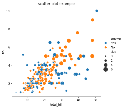
대표적인 수정 작업 중 하나는 그림의 제목을 추가하는 것입니다. 위의 그림에 제목을 추가해봅니다.
g = sns.relplot(x="total_bill", y="tip", hue="smoker", size="size",
    sizes=(15, 200), data=tips, kind='scatter')
g = g.set_titles('scatter plot example')
그런데 어떤 경우에는 (이유를 파악하지 못했습니다) 제목이 추가되지 않습니다. 이 때는 아래의 코드를 실행해보세요. Matplotlib 은 가장 최근의 그림 위에 plots 을 덧그립니다. 아래 코드는 이미 그려진 g 위에 제목을 추가하는 코드입니다.
g = sns.relplot(x="total_bill", y="tip", hue="smoker", size="size",
    sizes=(15, 200), data=tips, kind='scatter')
plt.title('scatter plot example')
Save
relplot() 함수를 실행할 때마다 새로운 그림을 그리기 때문에 이들을 변수로 만든 뒤, 각각 추가작업을 할 수 있습니다. 그 중 하나로 그림을 저장할 수 있습니다. 두 종류의 그림을 g0, g1 으로 만든 뒤, 각 그림을 savefig 함수를 이용하여 저장합니다. 저장된 그림을 살펴봅니다.
참고로 FacetGrid 는 savefig 기능을 제공하지만, AxesSubplot 은 이 기능을 제공하지 않습니다. 물론 matplotlib.pyplot.savefig() 함수나 get_figure().savefig() 함수를 이용하면 되지만, 코드가 조금 길어집니다. 이러한 측면에서도 scatterplot() 보다 relplot() 을 이용하는 것이 덜 수고스럽습니다.
g0 = sns.relplot(x="total_bill", y="tip", hue="smoker",
    size="size", data=tips, kind='scatter')
g1 = sns.relplot(x="total_bill", y="tip", size="size",
    sizes=(15, 200), data=tips)

g0.savefig('total_bill_tip_various_color_by_size.png')
g1.savefig('total_bill_tip_various_size_by_size.png')
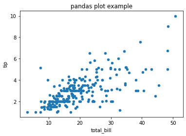
Pandas.DataFrame.plot
Pandas 의 DataFrame 에는 손쉽게 plot 을 그리는 함수가 구현되어 있습니다. kind 에 plot 의 종류를, x, y, 그 외의 title 과 같은 attributes 를 keywords argument 형식으로 입력할 수 있습니다. 그런데 DataFrame 의 plot 함수의 return type 은 Figure 가 아닌, AxesSubplot 입니다. 앞서 언급한 것처럼 AxesSubplot 은 그림의 저장 기능을 직접 제공하지 않습니다. 대신 AxesSubplot.get_figure() 를 이용하여 Figure 를 만들면 savefig 를 이용할 수 있습니다.
g = tips.plot(x='total_bill', y='tip', kind='scatter', title='pandas plot example')
g = g.get_figure()
g.savefig('pandas_plot_example.png')
혹은 matplotlib.pyplot.savefig 를 이용하여 AxesSubplot 상태에서 바로 저장할 수도 있습니다.
또한 위에서 return 을 변수로 받지 않고도 그림을 저장하였는데, 이는 matplotlib 은 어떤 그림을 저장할 것인지 설정하지 않으면 가장 마지막에 그린 그림에 대하여 저장을 수행합니다. 그런데 이런 코드는 혼동이 될 수 있기 때문에 코드가 한 줄 더 길어지지만, 저는 return type 을 명시하는 위의 방식을 선호합니다.
ax = tips.plot(x='total_bill', y='tip', kind='scatter', title='pandas plot example')
plt.savefig('pandas_plot_example_2.png')

matplotlib.pyplot.close()
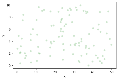
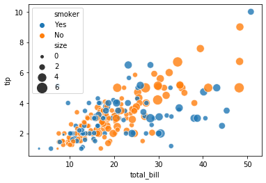
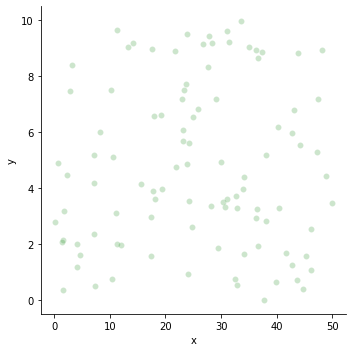
seaborn.relplot() 을 두 번 이용할 경우 각각의 그림이 그려졌습니다. 그런데 seaborn.scatterplot() 을 실행하면 두 그림이 겹쳐져 그려집니다. 이를 알아보기 위하여 random noise data 를 만들었습니다.
data = {
    'x': np.random.random_sample(100) * 50,
    'y': np.random.random_sample(100) * 10
}
random_noise_df = pd.DataFrame(data, columns=['x', 'y'])
random_noise_df.head(5)
| x | y | |
|---|---|---|
| 0 | 46.181098 | 1.073238 |
| 1 | 19.155420 | 6.603210 |
| 2 | 32.797057 | 3.273879 |
| 3 | 33.897212 | 3.974610 |
| 4 | 24.294968 | 5.602740 |
각각의 데이터를 seaborn.scatterplot() 에 넣으니 두 그림이 겹쳐져 그려집니다.
g0 = sns.scatterplot(x="total_bill", y="tip", hue='smoker',
    alpha=0.8, size="size", sizes=(15, 200), data=tips)
g1 = sns.scatterplot(x="x", y="y", alpha=0.2, color='g', data=random_noise_df)
실제로 g0, g1 의 메모리 주소가 같습니다.
g0, g1
(<matplotlib.axes._subplots.AxesSubplot at 0x7fc7ead8ff98>,
 <matplotlib.axes._subplots.AxesSubplot at 0x7fc7ead8ff98>)
이 경우, 두 그림을 다르게 그리기 위해서는 matplotlib.pyplot.close() 함수를 중간에 실행시켜야 합니다. Matplotlib 은 현재의 Figure 가 닫히지 않으면 계속 그 Figure 위에 그림을 덧그리는 형식입니다. 그래서 앞서 matplotlib.pyplot.title() 함수를 실행하여 제목을 더할 수도 있었습니다. 즉 그림이 계속 수정된다는 의미입니다.
g0 = sns.scatterplot(x="total_bill", y="tip", hue='smoker',
    alpha=0.8, size="size", sizes=(15, 200), data=tips)
plt.close()
g1 = sns.scatterplot(x="x", y="y", alpha=0.2, color='g', data=random_noise_df)
그래서 중간에 close() 를 실행한 경우에는 각각의 그림에 대하여 제목을 추가하여 Figure 로 만들 수 있습니다.
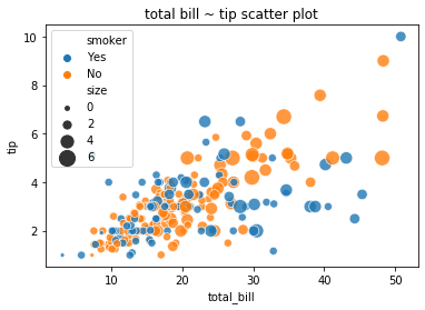
g0.set_title('total bill ~ tip scatter plot')
g0.get_figure()
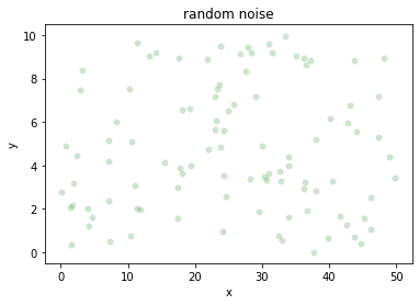
g1.set_title('random noise')
g1.get_figure()
이 때는 메모리 주소가 다릅니다.
g0, g1
(<matplotlib.axes._subplots.AxesSubplot at 0x7fc7ead7a630>,
 <matplotlib.axes._subplots.AxesSubplot at 0x7fc7eacd00b8>)
그럼 언제 matplotlib.pyplot.close() 가 실행될까요? relplot() 이 다시 호출될 때 이전에 그리던 Figure 를 닫고, 새 Figure 를 그리기 시작합니다.
g0 = sns.relplot(x="total_bill", y="tip", hue='smoker',
    alpha=0.8, size="size", sizes=(15, 200), data=tips)
g1 = sns.scatterplot(x="x", y="y", alpha=0.2, color='g', data=random_noise_df)
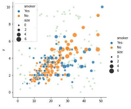
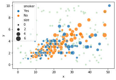
그래서 seaborn.scatterplot() 을 실행한 뒤 seaborn.relplot() 을 실행하면 그림이 분리되어 그려집니다. 혼동될 수 있으니 새 그림이 그려질 때에는 습관적으로 close() 함수를 호출하는 것이 명시적입니다.
g0 = sns.scatterplot(x="total_bill", y="tip", hue='smoker',
    alpha=0.8, size="size", sizes=(15, 200), data=tips)
g1 = sns.relplot(x="x", y="y", alpha=0.2, color='g', data=random_noise_df)
Plotting with numerical data 2
Line plots
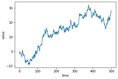
데이터가 순차적 형식일 경우 line plot 은 경향을 확인하는데 유용합니다. 우리는 임의의 시계열 데이터를 만들어 line plot 을 그려봅니다. cumsum() 함수는 지금까지의 모든 값을 누적한다는 의미입니다. 자연스러운 순차적 흐름을 지닌 데이터가 만들어질 겁니다.
data = {
    'time': np.arange(500),
    'value': np.random.randn(500).cumsum()
}
df = pd.DataFrame(data)
df.head(5)
| time | value | |
|---|---|---|
| 0 | 0 | 0.207275 |
| 1 | 1 | -1.485134 |
| 2 | 2 | -1.718115 |
| 3 | 3 | -1.624952 |
| 4 | 4 | -1.555609 |
seaborn.lineplot() 을 이용하여 x 와 y 축에 어떤 변수를 이용할지 정의합니다.
g = sns.lineplot(x="time", y="value", data=df)
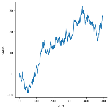
이는 relplot() 에서 kind 를 ‘line’ 으로 정의하는 것과 같습니다. 물론 return type 은 앞서 언급한것처럼 다릅니다.
g = sns.relplot(x="time", y="value", kind="line", data=df)
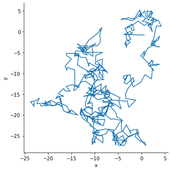
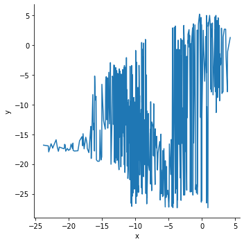
위 데이터는 x 를 중심으로 데이터가 정렬된 경우입니다. 그런데 때로는 데이터가 정렬되지 않은 경우도 있습니다. 이를 위하여 임의의 2 차원 데이터 500 개를 생성합니다.
data = np.random.randn(500, 2).cumsum(axis=0)
df = pd.DataFrame(data, columns=["x", "y"])
df.head(5)
| x | y | |
|---|---|---|
| 0 | 0.568999 | -0.805323 |
| 1 | -3.756781 | -0.687732 |
| 2 | -2.478935 | 0.032900 |
| 3 | -1.896840 | -0.350074 |
| 4 | -2.633141 | -0.623276 |
x 를 기준으로 정렬되지 않았기 때문에 마치 좌표 위를 이동하는 궤적과 같은 line plot 이 그려졌습니다.
g = sns.relplot(x="x", y="y", sort=False, kind="line", data=df)
이를 x 축 기준으로 정렬하여 그리려면 sort=True 로 설정하면 됩니다. 시계열 형식의 데이터의 경우, 안전한 plotting 을 위하여 sort 는 기본값이 True 로 정의되어 있습니다.
g = sns.relplot(x="x", y="y", sort=True, kind="line", data=df)
Aggregation and representing uncertainty
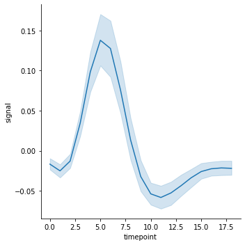
seaborn.lineplot() 의 장점 중 하나는 신뢰 구간 (confidence interval) 과 추정 회귀선 (estminated line) 을 손쉽게 그려준다는 점입니다. 이를 알아보기 위하여 fMRI 데이터를 이용합니다. 이 데이터는 각 사람 (subject) 의 활동 종류 (event) 에 따라 각 시점 (timepoint) 별로 fMRI 의 측정값 중 하나의 센서값을 정리한 시계열 데이터입니다.
fmri = sns.load_dataset("fmri")
fmri.head(5)
| subject | timepoint | event | region | signal | |
|---|---|---|---|---|---|
| 0 | s13 | 18 | stim | parietal | -0.017552 |
| 1 | s5 | 14 | stim | parietal | -0.080883 |
| 2 | s12 | 18 | stim | parietal | -0.081033 |
| 3 | s11 | 18 | stim | parietal | -0.046134 |
| 4 | s10 | 18 | stim | parietal | -0.037970 |
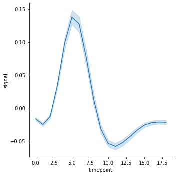
lineplot() 의 기본값은 신뢰 구간과 추정 회귀선을 함께 그리는 것입니다. 아래 그림은 subject 와 event 의 구분 없이 timepoint 별로 반복적으로 관측된 값을 바탕으로 그려진, 신뢰 구간과 추정 회귀선 입니다.
g = sns.relplot(x="timepoint", y="signal", kind="line", data=fmri)
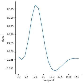
신뢰 구간을 제거하기 위해서는 ci 를 None 으로 설정합니다. ci 는 confidence interval 의 약자입니다. 하지만 추정된 회귀선은 그려집니다.
g = sns.relplot(x="timepoint", y="signal", kind="line", data=fmri, ci=None)
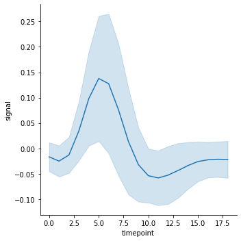
혹은 데이터의 표준 편차를 이용하여 confidence interval 을 그릴 수도 있습니다.
g = sns.relplot(x="timepoint", y="signal", kind="line", data=fmri, ci="sd")
혹은 bootstrap sampling (복원 반복 추출) 을 이용하여 50 % 의 값을 confidence interval 로 이용할 경우에는 ci=50 을 입력합니다. 이 때 boostrap sampling 의 개수도 n_boot 에서 설정할 수 있습니다.
g = sns.relplot(x="timepoint", y="signal", kind="line", data=fmri, ci=50, n_boot=5000)
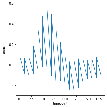
추정 회귀선은 estimator 를 None 으로 설정하면 제거됩니다. 기본 추정 방법은 x 를 기준으로 moving windowing 을 하는 것입니다. 추정선이 없다보니 주파수처럼 signal 값이 요동치는 모습을 볼 수 있습니다.
g = sns.relplot(x="timepoint", y="signal", kind="line", data=fmri, estimator=None)
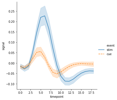
Add conditions to line plot
seaborn.lineplot() 도 seaborn.scatterplot() 처럼 hue 와 style 을 설정할 수 있습니다.
g = sns.relplot(x="timepoint", y="signal", hue="event", kind="line", data=fmri)

g = sns.relplot(x="timepoint", y="signal", hue="event",
    style="event", kind="line", data=fmri)
혹은 hue 와 style 을 다른 기준으로 정의하거나, 선 중간에 x 의 밀도에 따라 marker 를 입력할 수도 있습니다.
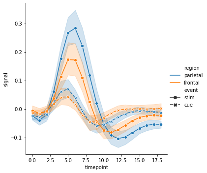
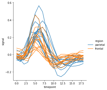
g = sns.relplot(x="timepoint", y="signal", hue="region", style="event",
    markers=True, kind="line", data=fmri)
혹은 선의 색은 ‘region’ 에 따라 구분하지만, 각 선은 ‘subject’ 를 기준으로 중복으로 그릴 경우 units 에 ‘subject’ 를 입력합니다. 만약 units 을 설정하면 이때는 반드시 estimator=None 으로 설정해야 합니다. 여러 개의 ‘subject’ 가 존재하다보니 선이 지저분하게 겹칩니다.
g = sns.relplot(x="timepoint", y="signal", hue="region",
    units="subject", estimator=None, kind="line",
    data=fmri.query("event == 'stim'"))
Plotting with date data
시계열 형식의 데이터 중 하나는 x 축이 날짜 형식인 데이터입니다.
data = {
    'time': pd.date_range("2017-1-1", periods=500),
    'value': np.random.randn(500).cumsum()
}
df = pd.DataFrame(data)
df.head(5)
| time | value | |
|---|---|---|
| 0 | 2017-01-01 | -0.641428 |
| 1 | 2017-01-02 | 0.324469 |
| 2 | 2017-01-03 | 0.732299 |
| 3 | 2017-01-04 | -1.069557 |
| 4 | 2017-01-05 | -2.109998 |
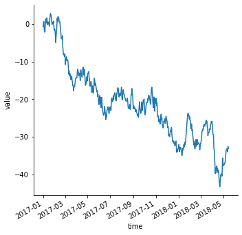
이 역시 seaborn.lineplot() 을 이용하여 손쉽게 그릴 수 있습니다. 추가로 autofmt_xdate() 함수를 이용하면 x 축의 날짜가 서로 겹치지 않게 정리를 도와줍니다.
g = sns.relplot(x="time", y="value", kind="line", data=df)
g.fig.autofmt_xdate()
Multiple plots
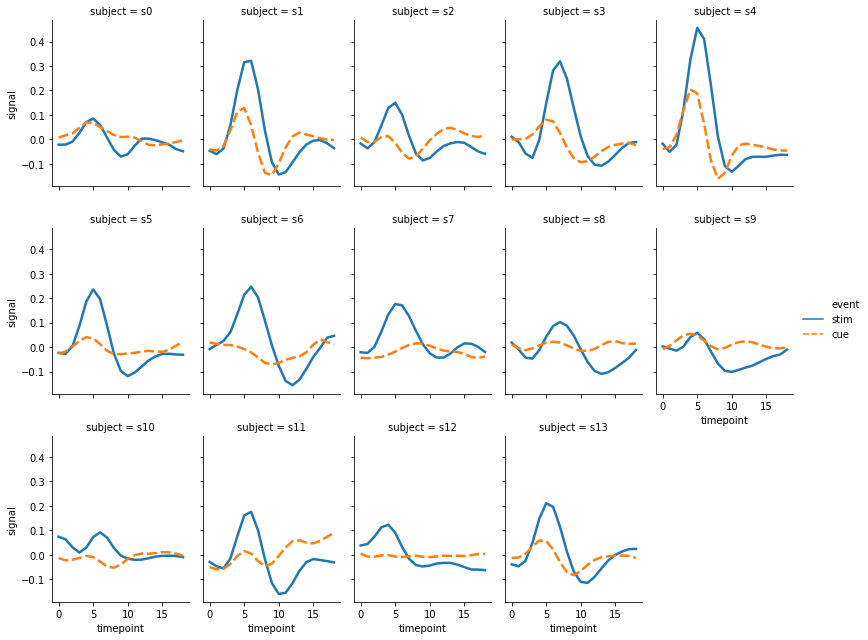
앞서 seaborn.scatterplot() 과 seaborn.relplot() 의 return type 이 각각 AxesSubplot 과 FacetGrid 로 서로 다름을 살펴보았습니다. seaborn.relplot() 의 장점은 여러 장의 plots 을 손쉽게 그린다는 점입니다. 각 ‘subject’ 별로 line plot 을 그려봅니다. 이때는 col 을 ‘subject’ 로 설정한 뒤, col 의 최대 개수를 col_wrap 에 설정합니다. ‘subject’ 의 개수가 이보다 많으면 다음 row 에 이를 추가합니다. 몇 가지 유용한 attributes 도 함께 설정합니다. aspect 는 각 subplot 의 세로 대비 가로의 비율입니다. 세로:가로가 4:3 인 subplots 이 그려집니다. 그리고 세로의 크기는 height 로 설정할 수 있습니다.
g = sns.relplot(x="timepoint", y="signal", hue="event", style="event",
    col="subject", col_wrap=5, height=3, aspect=.75, linewidth=2.5,
    kind="line", data=fmri.query("region == 'frontal'"))
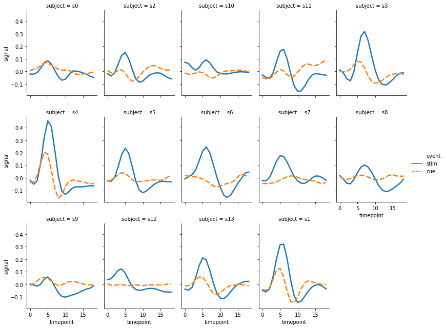
그런데 위의 그림에서 col 의 값이 정렬된 순서가 아닙니다. 순서를 정의하지 않으면 데이터에 등장한 순서대로 이 값이 그려집니다. 이때는 사용자가 col_order 에 원하는 값을 지정하여 입력할 수 있습니다. row 역시 row_order 를 제공하니, row 단위로 subplots 을 그릴 때는 이를 이용하면 됩니다.
col_order = [f's{i}' for i in range(14)]

g = sns.relplot(x="timepoint", y="signal", hue="event", style="event",
    col="subject", col_wrap=5, height=3, aspect=.75, linewidth=2.5,
    kind="line", data=fmri.query("region == 'frontal'"),
    col_order=col_order
)
이는 scatter plot 에도 적용할 수 있습니다. 예를 들어 column 은 변수 ‘time’ 에 따라 서로 다르게 scatter plot 을 그릴 경우, 다음처럼 col 에 ‘time’ 을 입력합니다. hue, size 와 같은 설정은 공통으로 적용됩니다.
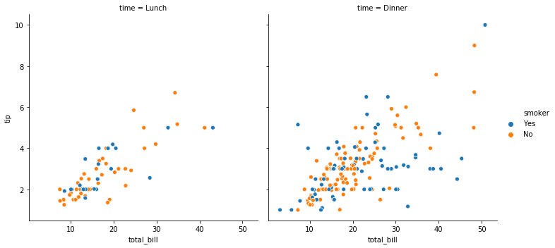
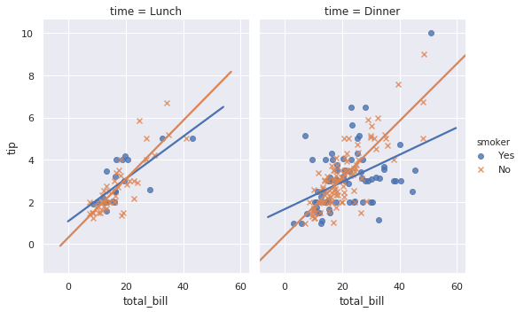
g = sns.relplot(x="total_bill", y="tip", hue="smoker", data=tips, col="time")
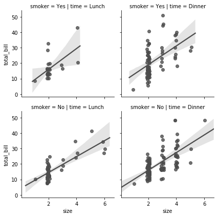
row 를 성별 기준으로 정의하면 (2,2) 형식의 grid plot 이 그려집니다. 그런데 plot 마다 (sex, time) 이 모두 기술되니 title 이 너무 길어보입니다. 이후 살펴볼 FacetGrid 에서는 margin_title 을 이용하여 깔끔하게 col, row 의 기준을 표시하는 방법이 있습니다. 아마 0.9.0 이후의 버전에서는 언젠가 seaborn.relplot() 에도 그 기능이 제공되지 않을까 기대해봅니다.
g = sns.relplot(x="total_bill", y="tip", hue="smoker",
    data=tips, col="time", row="sex")
Plotting with categorical data
Categorical scatterplots
앞서 seaborn.scatterplot() 과 seaborn.lineplot() 의 사용법, 그리고 이를 감싸는 seaborn.relplot() 함수와의 차이를 살펴보았습니다. 변수가 명목형일 경우에는 seaborn.relplot() 대신 seaborn.catplot() 을 이용할 수 있습니다. catplot() 도 stripplot(), boxplot(), barplot() 등 다양한 함수들을 호출하는 상위 함수 입니다.
Strip plot
앞서 order, kind, 등의 argument 사용법에 대하여 살펴보았으니, 여기에서는 어떤 그림들을 그릴 수 있는지에 대해서만 간단히 살펴봅니다.
g = sns.catplot(x="smoker", y="tip", kind='strip',
    order=["No", "Yes"], jitter=False, data=tips)
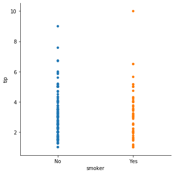
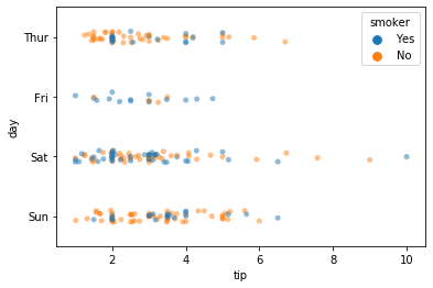
seaborn.catplot() 의 kind 에 입력되는 값은 함수 이름입니다. 이 역시 seaborn.stripplot() 을 이용할 수도 있습니다. jitter 는 데이터 포인트가 겹쳐 그리는 것을 방지하기 위하여 작은 permutation 을 함을 의미합니다.
g = sns.stripplot(x="tip", y="day", hue='smoker', alpha=0.5, data=tips)
Boxplots
Box plot 도 그릴 수 있습니다.
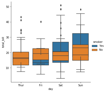
g = sns.catplot(x="day", y="total_bill", hue="smoker", kind="box", data=tips)
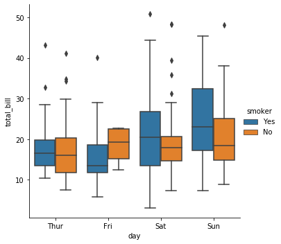
seaborn.boxplot() 이나 이 함수가 이용하는 matplotlib.pyplot.boxplot() 이 이용하는 arguments 를 입력할 수도 있습니다. dodge=False 로 입력하면 ‘smoker’ 유무 별로 각각 boxplot 이 겹쳐져 그려지는데, 이왕이면 각 box 를 투명하게 만들면 좋을듯 합니다. 그런데 아직 boxplot 의 투명도를 조절하는 argument 를 찾지 못했습니다.
찾다보면 seaborn 으로 여러 설정들을 할 수는 있지만, 이를 위해서는 matplotlib 함수들의 arguments 를 찾아야 하는 일들이 발생합니다. seaborn.catplot() 의 그림을 수정하기 위하여 seaborn.boxplot() 의 arguments 를 확인하고, 또 디테일한 설정을 하기 위해서 seaborn.boxplot() 이 이용하는 matplotlib.pyplot.boxplot() 의 arguments 를 확인해야 합니다. 복잡해지네요.
g = sns.catplot(x="day", y="total_bill", hue="smoker",
    kind="box", data=tips, dodge=False)
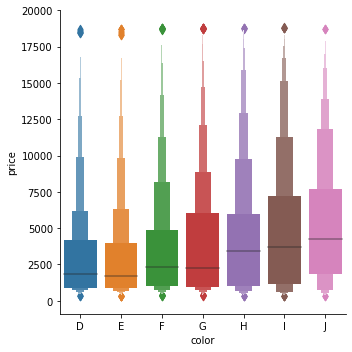
Boxen plot 은 데이터의 분포를 box 의 width 로 표현하는 plot 입니다. 이를 위하여 ‘diamonds’ dataset 을 이용합니다.
diamonds = sns.load_dataset("diamonds")
diamonds.head(5)
| carat | cut | color | clarity | depth | table | price | x | y | z | |
|---|---|---|---|---|---|---|---|---|---|---|
| 0 | 0.23 | Ideal | E | SI2 | 61.5 | 55.0 | 326 | 3.95 | 3.98 | 2.43 |
| 1 | 0.21 | Premium | E | SI1 | 59.8 | 61.0 | 326 | 3.89 | 3.84 | 2.31 |
| 2 | 0.23 | Good | E | VS1 | 56.9 | 65.0 | 327 | 4.05 | 4.07 | 2.31 |
| 3 | 0.29 | Premium | I | VS2 | 62.4 | 58.0 | 334 | 4.20 | 4.23 | 2.63 |
| 4 | 0.31 | Good | J | SI2 | 63.3 | 58.0 | 335 | 4.34 | 4.35 | 2.75 |
이 데이터는 color 가 정렬되어 있지 않은 데이터입니다. 이를 정렬하여 ‘color’ 별 ‘price’ 에 대한 boxen plot 을 그려봅니다.
g = sns.catplot(x="color", y="price", kind="boxen", data=diamonds.sort_values("color"))
Violinplots
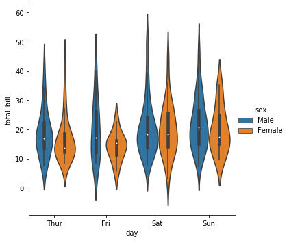
Violin plot 은 분포를 밀도 함수로 표현하는 그림입니다. 이 역시 hue 를 설정할 수 있습니다.
g = sns.catplot(x="day", y="total_bill", kind="violin", hue="sex", data=tips)
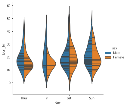
그런데 hue 가 두 종류라면 굳이 두 개의 분포를 나눠 그릴 필요는 없어보입니다. 이때는 split=True 로 설정하면 두 종류의 분포를 서로 붙여서 보여줍니다.
g = sns.catplot(x="day", y="total_bill", hue="sex",
    kind="violin", split=True, inner="stick", data=tips)
Bar plots
Bar plot 은 명목형 데이터의 분포를 확인하는데 이용됩니다. 이를 위하여 타이타닉 생존자 데이터를 이용합니다.
titanic = sns.load_dataset("titanic")
titanic.head(5)
| survived | pclass | sex | age | sibsp | parch | fare | embarked | class | who | adult_male | deck | embark_town | alive | alone | |
|---|---|---|---|---|---|---|---|---|---|---|---|---|---|---|---|
| 0 | 0 | 3 | male | 22.0 | 1 | 0 | 7.2500 | S | Third | man | True | NaN | Southampton | no | False |
| 1 | 1 | 1 | female | 38.0 | 1 | 0 | 71.2833 | C | First | woman | False | C | Cherbourg | yes | False |
| 2 | 1 | 3 | female | 26.0 | 0 | 0 | 7.9250 | S | Third | woman | False | NaN | Southampton | yes | True |
| 3 | 1 | 1 | female | 35.0 | 1 | 0 | 53.1000 | S | First | woman | False | C | Southampton | yes | False |
| 4 | 0 | 3 | male | 35.0 | 0 | 0 | 8.0500 | S | Third | man | True | NaN | Southampton | no | True |
seaborn.barplot() 역시 seaborn.catplot() 을 이용하여 그릴 수 있습니다. 성별, 그리고 선실별 생존율을 그려봅니다.
g = sns.catplot(x="sex", y="survived", hue="class", kind="bar", data=titanic)
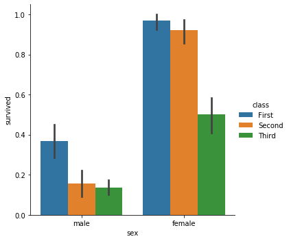
hue 의 종류가 여러 개이면 x 축의 종합적인 분포가 잘 보이지 않습니다. 누적 형식의 bar plot 을 그리기 위해서는 dodge=False 로 설정합니다.
g = sns.catplot(x="sex", y="survived", hue="class",
    kind="bar", data=titanic, dodge=False)
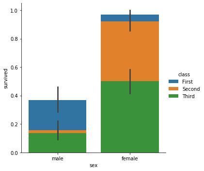
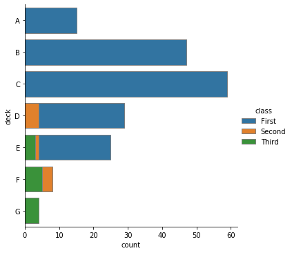
누적 형식으로 그림을 그리니 생존율이 명확히 보이지 않습니다. 생존자 수를 bar plot 으로 그려봅니다. 이를 위해서 seaborn.countplot() 를 이용합니다. 이번에는 x, y 축을 바꿔보았고, bar 의 모서리에 선을 칠하기 위하여 edgecolor 를 조절하였습니다. edgecolor 는 그 값이 분명 실수형식인데, 입력할 때에는 str 형식으로 입력해야 합니다. 이는 matplotlib 의 함수를 이용하기 때문인데, 다음 버전에서는 직관적이게 float 를 입력하도록 바꿔줬으면 좋겠네요.
g = sns.catplot(y="deck", hue="class", kind="count",
    data=titanic, dodge=False, edgecolor=".5")
Point plots
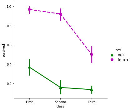
그 외에도 class 별 생존율을 선으로 연결하는 point plot 을 그릴 수 있고, 이 때 이용하는 linestyles 나 markers 를 입력할 수도 있습니다. 이 때 linestyles 와 markers 의 길이는 hue 의 종류의 개수와 같아야 합니다.
g = sns.catplot(x="class", y="survived", hue="sex",
    palette={"male": "g", "female": "m"},
    markers=["^", "o"], linestyles=["-", "--"],
    kind="point", data=titanic)
Visualizing distribution
이번에는 data distribution plot 을 그려봅니다.
Plotting univariate distributions
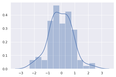
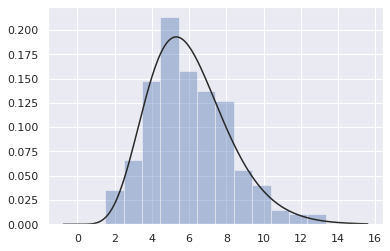
Seaborn 은 univariate distribution 과 bivariate distribution 을 그리는 plot 을 지원합니다. 이를 위하여 평균 0, 표준편차 1인 정규분포에서 임의의 100 개의 데이터 x 를 만듭니다. seaborn.distplot() 함수에 이를 입력하면 histogram 과 추정된 밀도 곡선이 함께 그려집니다.
x = np.random.normal(size=100)
g = sns.distplot(x)
그런데 seaborn.distplot() 의 return type 이 matplotlib 의 AxesSubplot 입니다.
g
<matplotlib.axes._subplots.AxesSubplot at 0x7fa032760e80>
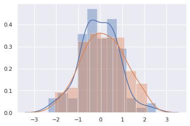
즉 seaborn.distplot() 함수를 호출할 때마다 새로운 그림을 그리는 것이 아니라, 이전 그림에 덧칠을 할 수 있다는 의미입니니다. 이번에는 동일한 정규분포에서 다른 샘플 y 를 만들고, x 와 y 를 각각 seaborn.distplot() 에 입력합니다. 두 개의 그림이 겹쳐져 그려짐을 확인할 수 있습니다. 분포 그림들이 주로 다른 분포들과 겹쳐져 거려지는 경우가 많기 때문으로 생각됩니다.
y = np.random.normal(size=100)
g0 = sns.distplot(x)
g1 = sns.distplot(y)
Histograms
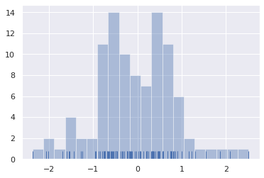
seaborn.distplot() 의 기본값은 hist=True, kde=True, rug=False 입니다. hist 는 historgram 을 그릴지 묻는 것이며, kde 는 kernel density estimation 을 수행할지 묻는 것입니다. 또한 rug 는 데이터 포인트를 그릴지 묻는 것입니다. 참고로 seaborn.kdeplot() 과 seaborn.rugplot() 은 함수입니다. 즉 seaborn.distplot() 은 여러 종류의 data distribution plots 을 한 번에 그려주는 종합함수입니다. kde=False, rug=True 로 변경하면 여전히 histogram 은 그려지지만 밀도 함수는 제거되고, x 축에 데이터의 밀도를 표현하는 그림이 그려집니다.
g = sns.distplot(x, hist=True, kde=False, rug=True, bins=20)
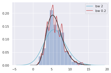
Kernel density estimation
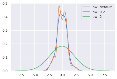
seaborn.kdeplot() 은 다양한 종류의 kernel 을 제공합니다. 기본값은 gaussian kernel 을 이용합니다. 이때 gaussian kernel 의 bandwidth 를 데이터 기반으로 측정하기도 하고, 혹은 bw 를 통하여 직접 설정할 수도 있습니다. 아래 그림은 bandwidth 가 넓어지면 smooth 한 distribution 이, bandwidth 가 좁아지면 날카로운 density estimation 이 이뤄짐을 볼 수 있습니다.
sns.kdeplot(x, label='bw: default')
sns.kdeplot(x, bw=.2, label="bw: 0.2")
sns.kdeplot(x, bw=2, label="bw: 2")
plt.legend()
Fitting parametric distributions
혹은 fit 에 특정 함수를 입력할 수도 있습니다.
x = np.random.gamma(6, size=200)
g = sns.distplot(x, kde=False, fit=stats.gamma)
또한 seaborn.distplot() 에서 kde=True 를 설정하는 것은 seaborn.kdeplot() 을 실행하는 것과 같기 때문에 이 때 필요한 설정은 kde_kws 에 입력할 수 있습니다.
g = sns.distplot(x, hist=True, kde=True, fit=stats.gamma,
    kde_kws={'bw':2.0, 'color':'c', 'label':'bw 2'})
g = sns.distplot(x, hist=False, kde=True, fit=stats.gamma,
    kde_kws={'bw':0.2, 'color':'r', 'label':'bw 0.2'})
Plotting bivariate distributions
2 차원의 정규분포로부터 임의의 데이터 200 개를 만들었습니다.
mean, cov = [0, 1], [(1, .5), (.5, 1)]
data = np.random.multivariate_normal(mean, cov, 200)
df = pd.DataFrame(data, columns=["x", "y"])

df.head(3)
| x | y | |
|---|---|---|
| 0 | -0.681701 | 1.977984 |
| 1 | -0.108547 | 1.047261 |
| 2 | -0.767767 | -0.329327 |
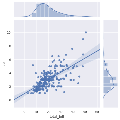
이 데이터의 joint distribution plot 을 그리기 위하여 seaborn.jointplot() 을 이용할 수 있습니다. 종류는 scatter plot, kernel density estimation, regression, residual, hexbin plot 을 제공합니다. 그 중 세 종류에 대해서 알아봅니다. kind 의 기본값은 scatter plot 입니다. 데이터를 입력하고 x, y 의 변수 이름을 입력할 수 있습니다.
g = sns.jointplot(x="x", y="y", kind='scatter', data=df)
혹은 x 와 y 를 각각 입력할수도 있습니다. 각각 좌표의 sequence 를 준비합니다.
x, y = data.T
print(x[:5])
print(y[:5])
[-0.68170061 -0.10854677 -0.76776747  0.67274982 -0.82073625]
[ 1.97798404  1.04726107 -0.32932665  0.51447462  1.39611539]
이번에는 kernel density estimation plot 을 그려봅니다.
g = sns.jointplot(x=x, y=y, kind="kde")
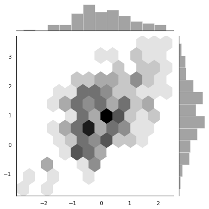
Hexbin plot 은 지역을 육각형으로 나눈 뒤, 각 부분의 밀도를 색으로 표현합니다.
g = sns.jointplot(x=x, y=y, kind="hex", color="k")
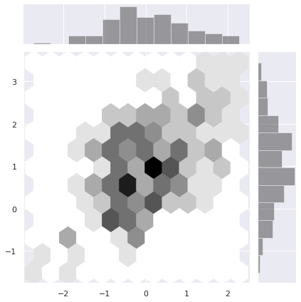
모서리 부분의 style 이 지저분합니다. 이 그림에 대해서만 style 을 임시로 바꾸려면 파이썬 문법의 with 을 이용할 수 있습니다.
with sns.axes_style("white"):
    g = sns.jointplot(x=x, y=y, kind="hex", color="k")
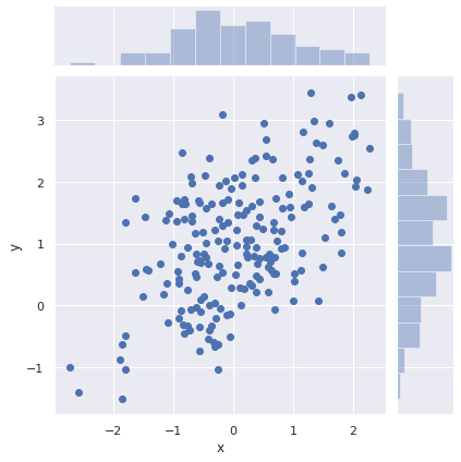
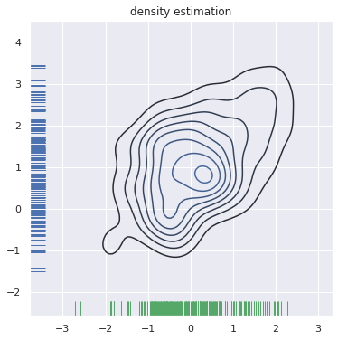
이번에는 각 변수의 분포를 seaborn.rugplot() 으로 대체해봅니다. seaborn.kdeplot() 의 그림은 정방형이 아니기 때문에 미리 그림의 크기를 matplotlib.pyplot.subplots() 을 이용하여 정의합니다. subplots() 함수를 이용하면 grid plot 을 그릴 수 있는데, 이는 matplotlib 의 사용법을 추가로 찾아보시기 바랍니다. 지금은 grid plot 을 만들지 않았기 때문에 아래처럼 하나의 plot 에 여러 종류의 plots 을 덧그렸습니다.
f, ax = plt.subplots(figsize=(6, 6))
g = sns.kdeplot(x, y, ax=ax)
g = sns.rugplot(x, color="g", ax=ax)
g = sns.rugplot(y, vertical=True, ax=ax)
g = g.set_title('density estimation')
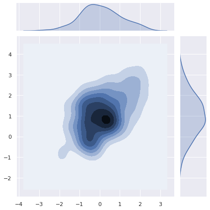
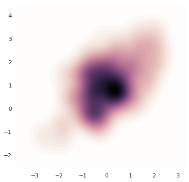
혹은 등고선이 아닌 색으로 밀도를 표현할 수도 있습니다. 이를 위해 colormap 을 따로 설정하고 shade=True 를 설정합니다. 등고선이 아니라 색으로 표현한다는 의미입니다. cmap 은 256 단계의 밀도에 대하여 RGBA 형식으로 표현된 color vector 입니다. 그 형식은 numpy.ndarray 입니다.
f, ax = plt.subplots(figsize=(6, 6))
cmap = sns.cubehelix_palette(as_cmap=True, dark=0, light=1, reverse=True)
g = sns.kdeplot(x, y, cmap=cmap, n_levels=60, shade=True)

print(type(cmap))
print(cmap.colors.shape)
<class 'matplotlib.colors.ListedColormap'>
(256, 4)
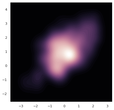
혹은 colormap 을 반대로 정의하면 밀도가 높은 부분을 진하게 표현할 수도 있습니다.
f, ax = plt.subplots(figsize=(6, 6))
cmap = sns.cubehelix_palette(as_cmap=True, dark=0, light=1, reverse=False)
g = sns.kdeplot(x, y, cmap=cmap, n_levels=60, shade=True)
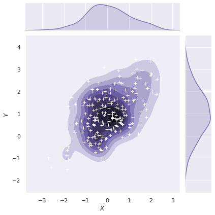
이번에는 kernel density estimation plot 위에 흰 색의 + marker 의 scatter plot 을 추가하였습니다.
g = sns.jointplot(x="x", y="y", data=df, kind="kde", color="m", shade=True)
g = g.plot_joint(plt.scatter, c="w", s=30, linewidth=1, marker="+")
g = g.set_axis_labels("$X$", "$Y$")
Visualizing linear relationships
seaborn.lineplot() 은 x 의 변화에 따른 y 값의 변화를 선으로 연결합니다. 이때 이용하는 estimator 의 기본 방식은 kernel density estimation 입니다. 다른 plotting 패키지와 비교하여 seaborn 의 장점 중 하나는 linear regression line 과 confidence interval 을 손쉽게 그려준다는 점입니다.
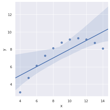
Linear regression models
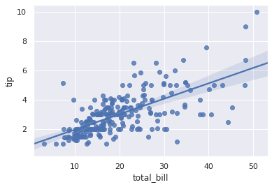
regplot() 은 하나의 그림을 그리는 함수이며, lmplot() 은 row, col 을 설정할 수 있는 multi plot 기능을 제공합니다. 그러므로 regplot() 의 return type 은 AxesSubplot 입니다.
g = sns.regplot(x="total_bill", y="tip", data=tips)
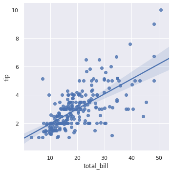
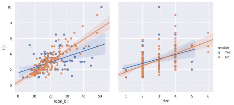
반대로 seaborn.lmplot() 은 FacetGrid 를 return 합니다. 즉 lmplot() 이 상위 함수 입니다.
g = sns.lmplot(x="total_bill", y="tip", data=tips)
그러므로 seaborn.lmplot() 은 col, row, aspect, hue, markers 등등의 multi plot 을 그리는데 필요한 attributes 를 모두 이용할 수 있습니다. 또한 ci=None 으로 설정하면 confidence interval 도 그리지 않습니다.
g = sns.lmplot(x="total_bill", y="tip", col="time", aspect=0.75,
    hue="smoker", markers=["o", "x"], ci=None, data=tips)
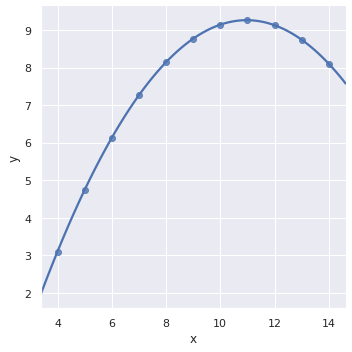
Fitting different kinds of models
Linear regression 이기 때문에 다항 선형 회귀식도 지원 합니다. anscombe dataset 은 각각 1, 2 차식으로부터 생성된 데이터가 포함되어 있습니다.
anscombe = sns.load_dataset("anscombe")
anscombe.head(5)
2차식으로부터 만들어진 데이터는 1차 선형 회귀 모델로 추정되기 어렵습니다.
g = sns.lmplot(x="x", y="y", data=anscombe.query("dataset == 'II'"))
order=2 로 변경하면 2차 다항 선형 회귀 방정식을 학습합니다. 그런데 2차 이상에서는 confidence interval 이 그려지지 않네요 (seaborn==0.9.0).
g = sns.lmplot(x="x", y="y", order=2, data=anscombe.query("dataset == 'II'"))
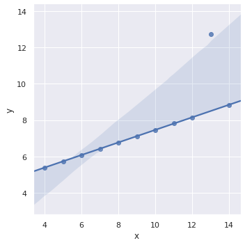
그 외에도 noise 를 제거하며 선형 회귀 모델을 학습하는 기능도 제공하지만, 이러한 과정은 seaborn 을 이용하는 것보다 외부에서 모델을 학습한 뒤 이를 plotting 하는 것이 더 적절합니다. 편리한 기능은 다항 선형 회귀식을 이용하는 것 까지라 생각합니다.
g = sns.lmplot(x="x", y="y", robust=True, data=anscombe.query("dataset == 'III'"))
Regression with other plottings
그 외에도 seaborn.jointplot() 과 seaborn.pairplot() 역시 두 변수 간의 관계를 표현하는 plot 이기 때문에 kind='reg' 로 설정하면 회귀식이 함께 표현됩니다.
g = sns.jointplot(x="total_bill", y="tip", data=tips, kind="reg")
g = sns.pairplot(tips, x_vars=["total_bill", "size"],
    y_vars=["tip"], hue="smoker", height=5, kind="reg")
Logistic regression
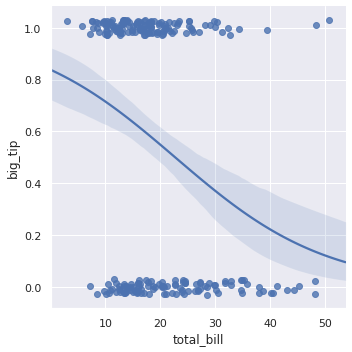
‘tips’ dataset 을 이용하여 로지스틱 회귀분석을 수행하기 위하여 데이터셋에 총 지출액 대비 15 % 이상의 팁을 준 경우를 ‘big_tip’ 이라 명합니다. ‘total_bill’ 을 이용하여 big tip 인지 확인하는 로지스틱 회귀 모델을 학습하려면 logistic=True 로만 설정하면 됩니다.
tips["big_tip"] = (tips.tip / tips.total_bill) > .15
g = sns.lmplot(x="total_bill", y="big_tip", data=tips, logistic=True, y_jitter=.03)
Utils for mupti-plots
앞서 seaborn.relplot() 의 row 와 col 에 변수를 입력함으로써 여러 개의 plots 을 한 번에 그리는 방법에 대하여 알아보았습니다. 이번에는 이 그림을 직접 그리는 방법에 대하여 알아봅니다. Seaborn 은 FacetGrid 와 PairGrid 라는 클래스를 제공합니다.
FacetGrid and map()
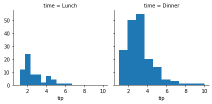
seaborn.FacetGrid 클래스는 첫번째 position argument 로 데이터셋을 입력받습니다. 그 뒤, col 을 데이터셋의 ‘time’ 을 기준으로 나눌 것이라 명명합니다. FacetGrid instance 를 만들면 아래처럼 빈 grid plot 이 그려집니다.
g = sns.FacetGrid(tips, col="time")

map 함수를 이용하여 각 subplot 을 그릴 함수를 첫번째로 입력하고, 뒤이어 그 함수들이 이용하는 변수 이름을 순서대로 입력합니다. col 을 ‘time’ 으로 나누었으니, 시간대 별로 ‘tip’ 의 histogram 이 그려집니다.
# sns.FacetGrid(data, row=None, col=None, ...)
g = sns.FacetGrid(tips, col="time")
g = g.map(plt.hist, "tip")
FacetGrid 는 col 설정이 가능하니 당연히 row 설정도 가능합니다. map 에는 첫번째 함수, 그 이후 position argument 로 그 함수가 이용하는 데이터셋 내의 변수명, 그 뒤로 plot 함수가 이용하는 argument 를 keyword argument 로 입력합니다. 함수로는 seaborn 의 함수도 이용이 가능합니다.
g = sns.FacetGrid(tips, row="smoker", col="time")
g = g.map(sns.regplot, "size", "total_bill", color=".3", x_jitter=.1)
그런데 각 subplot 의 조건이 너무 길게 표현됩니다. 이를 한 번만 표기하기 위해 margin_titles=True 로 설정합니다. 또한 추정 회귀선은 표현하지 않기 위해 seaborn.regplot() 의 fit_reg=False 로 설정합니다. 이처럼 subplot 을 그리는데 이용되는 arguments 를 입력할 수 있습니다.
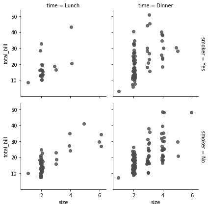
g = sns.FacetGrid(tips, row="smoker", col="time", margin_titles=True)
g = g.map(sns.regplot, "size", "total_bill", color=".3", fit_reg=False, x_jitter=.1)
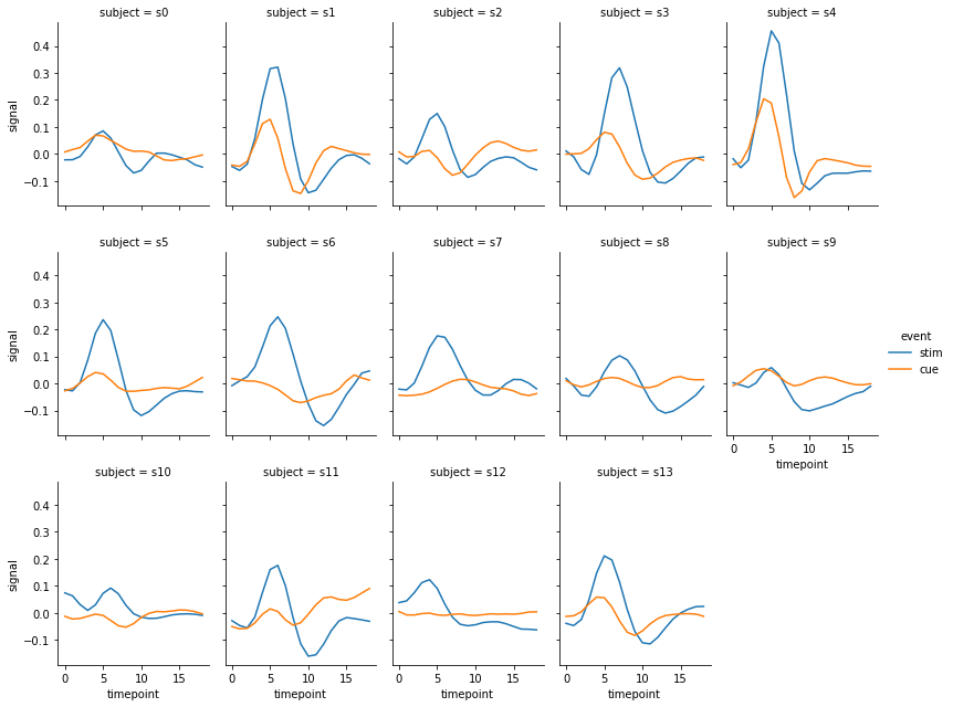
앞서서 seaborn.relplot() 을 이용하여 그렸던 fMRI 데이터의 subject 별 line plot 도 FacetGrid 를 이용하여 그릴 수 있습니다. 이 때 column 의 최대 개수나 column order 를 정의하는 부분은 FacetGrid 를 만들 때 모두 설정해야 합니다. hue 역시 이 때 미리 정의할 수 있습니다. 즉 앞서 seaborn.relplot() 을 그릴 때 kind=line 이고 col 에 변수가 입력되면 relplot() 함수 내에서 FacetGrid 를 만든 뒤, 각 subplots 을 그리는 것입니다.
fmri = sns.load_dataset("fmri").query("region == 'frontal'")
col_order = [f's{i}' for i in range(14)]

g = sns.FacetGrid(fmri, col='subject', col_wrap=5, col_order=col_order,
    aspect=.75, height=3, hue='event')
g = g.map(sns.lineplot, 'timepoint', 'signal')
g = g.add_legend()
Using custom functions
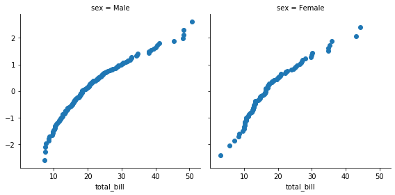
또한 사용자가 임의로 작성하는 함수를 FacetGrid 에 적용할 수도 있습니다. 아래는 quantile plot 을 그리는 함수를 만든 것입니다. quantile_plot() 함수는 x 변수를 입력받아 그 값을 정규분포로 fitting 한 뒤 이를 scatter plot 으로 표현합니다. quantile_plot() 함수는 하나의 변수만을 이용하니 map 함수에 ‘total_bill’ 변수 이름만을 입력합니다.
from scipy import stats

def quantile_plot(x, **kwargs):
    qntls, xr = stats.probplot(x, fit=False)
    plt.scatter(xr, qntls, **kwargs)

g = sns.FacetGrid(tips, col="sex", height=4)
g = g.map(quantile_plot, "total_bill");
두 개의 변수를 이용하는 함수라면 map 함수에 두 개의 변수 이름을 입력하면 됩니다. 각 변수의 값들이 각각 qqplot() 의 x 와 y 로 입력됩니다.
def qqplot(x, y, **kwargs):
    _, xr = stats.probplot(x, fit=False)
    _, yr = stats.probplot(y, fit=False)
    plt.scatter(xr, yr, **kwargs)

g = sns.FacetGrid(tips, col="smoker", height=4)
g = g.map(qqplot, "total_bill", "tip");
Pairwise relationships in a dataset
데이터셋의 탐색을 위하여 연속형 변수 별 상관관계를 확인할 scatter plot 과 각 변수 별 histogram 을 그릴 수도 있습니다. 이를 위하여 iris 데이터를 이용합니다.
iris = sns.load_dataset("iris")
iris.head(5)
| sepal_length | sepal_width | petal_length | petal_width | species | |
|---|---|---|---|---|---|
| 0 | 5.1 | 3.5 | 1.4 | 0.2 | setosa |
| 1 | 4.9 | 3.0 | 1.4 | 0.2 | setosa |
| 2 | 4.7 | 3.2 | 1.3 | 0.2 | setosa |
| 3 | 4.6 | 3.1 | 1.5 | 0.2 | setosa |
| 4 | 5.0 | 3.6 | 1.4 | 0.2 | setosa |
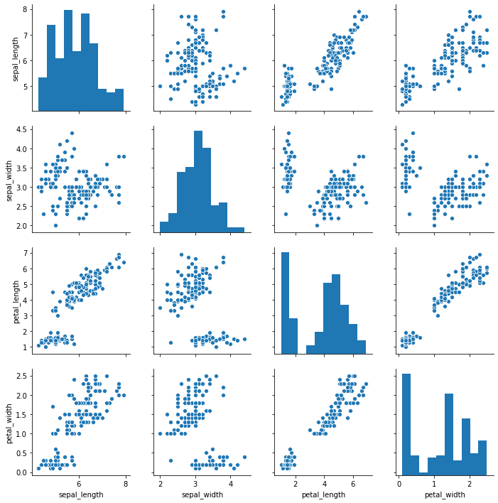
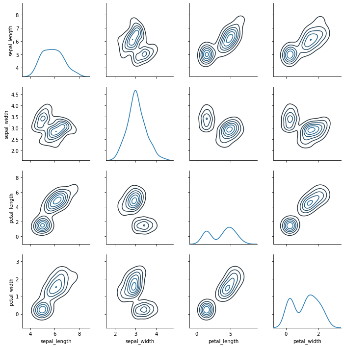
seaborn.pairplot() 함수를 이용하면 대각선에는 각 변수의 histogram 이, 그 외에는 두 연속형 변수 간의 상관관계가 scatter plot 으로 표현됩니다.
g = sns.pairplot(iris)
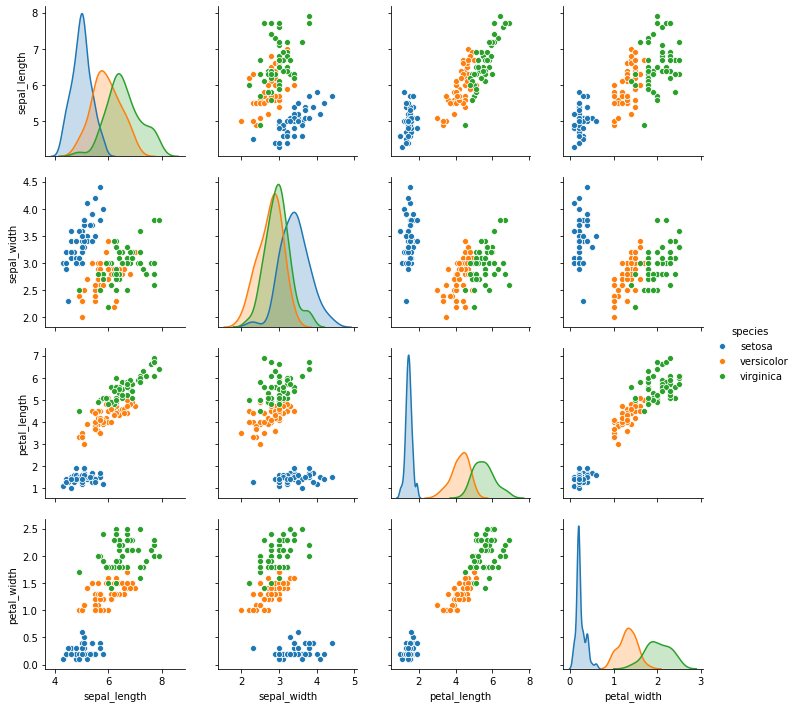
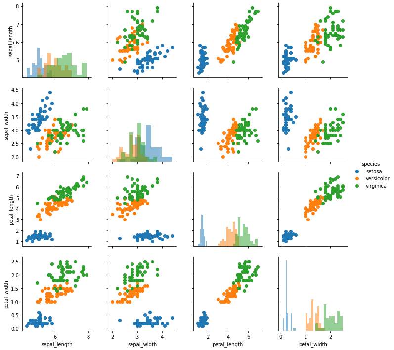
명목형 변수인 ‘species’ 별로 색을 다르게 칠하기 위해서 seaborn.pairplot() 함수의 hue 에 변수 이름을 입력할 수 있습니다. 여러 종류의 species 에 대하여 histogram 을 그리기 어려우니 대각선의 subplots 에 밀도 추정 line plot 을 그렸습니다.
g = sns.pairplot(iris, hue="species")
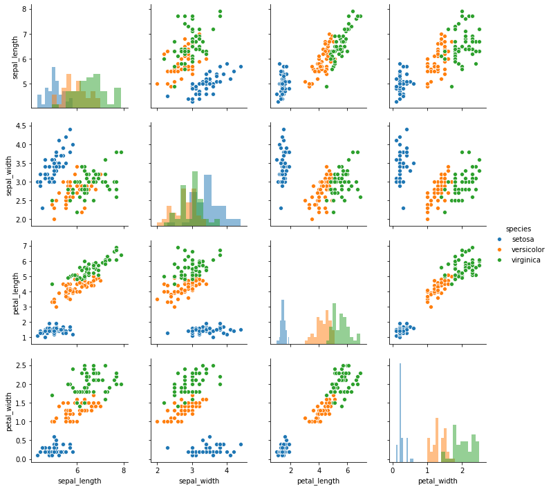
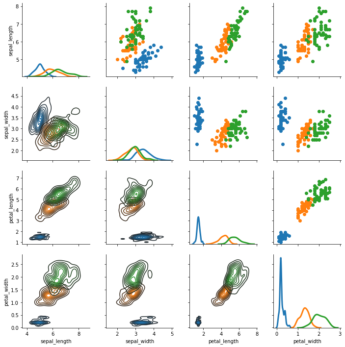
만약 반드시 histogram 을 그리겠다면 seaborn.pairplot() 의 diag_kind 에 ‘hist’ 를 입력합니다. seaborn==0.9.0 에서 지원되는 값은 ‘hist’ 와 ‘kde’ 뿐입니다. 그리고 diagonal subplots 을 그릴 때 이용하는 arguments 는 diag_kws 에 입력할 수 있습니다.
g = sns.pairplot(iris, hue="species", diag_kind="hist", height=2.5,
    diag_kws={'alpha':0.5})
이 역시 수작업으로 그릴 수 있습니다. 단, seaborn.PairGrid 는 변수 간 상관관계를 보이기 위한 그림이기 때문에 정방형의 grid plot 이 그려집니다. 그리고 대각선과 그 외에 각각 어떤 plot 을 그릴지 map_diag() 와 map_offdiag() 로 정의할 수 있습니다.
g = sns.PairGrid(iris)
g = g.map_diag(sns.kdeplot)
g = g.map_offdiag(sns.kdeplot, n_levels=6)
map_diag() 와 map_offdiag() 모두 각각의 plot 을 그리는데 필요한 arguments 를 keyword argument 형식으로 입력받습니다.
g = sns.PairGrid(iris, hue="species")
g = g.map_diag(plt.hist, alpha=0.5)
g = g.map_offdiag(plt.scatter)
g = g.add_legend()
혹은 대각선 위의 그림과 아래의 그림을 다르게 정의할 수도 있습니다. lw 는 line width 입니다.
g = sns.PairGrid(iris, hue='species')
g = g.map_upper(plt.scatter)
g = g.map_lower(sns.kdeplot)
g = g.map_diag(sns.kdeplot, lw=3, legend=True)
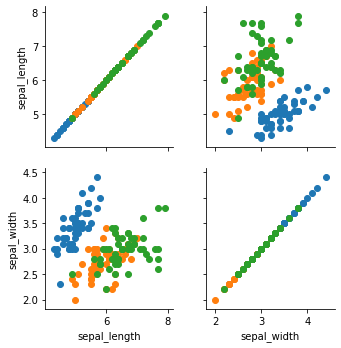
만약 데이터셋의 변수가 10 개라면 10 x 10 크기의 grid plot 이 그려집니다. 확인할 변수가 있다면 그 변수 이름들만을 seaborn.PairGrid 의 argument vars 에 입력합니다.
g = sns.PairGrid(iris, vars=["sepal_length", "sepal_width"], hue="species")
g = g.map(plt.scatter)
Style
Seaborn 의 그림들의 background color, grid line color, color map 등을 한 번에 설정할 수 있습니다. Seaborn 의 style 은 미리 정의되어 있는 위의 값들입니다. 기본적으로 다섯가지의 styles 을 제공합니다.
styles = ['darkgrid', 'whitegrid', 'dark', 'white', 'ticks']
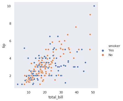
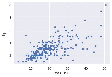
Style 은 figure 단위로 적용되기 때문에 FacetGrid 의 각 subplot 에 서로 다른 style 을 적용할 수는 없습니다. 만약 반드시 그래야 한다면 각 grid 의 subplot 마다 설정을 다르게 적용하여 직접 그림을 그려야 합니다. tips 데이터를 이용하여 다섯가지 스타일에 대하여 scatter plot 에서의 변화를 살펴봅니다.
# styles = ['darkgrid', 'whitegrid', 'dark', 'white', 'ticks']
sns.set(style="darkgrid")
g = sns.relplot(x="total_bill", y="tip", hue="smoker", data=tips)

# styles = ['darkgrid', 'whitegrid', 'dark', 'white', 'ticks']
sns.set(style="whitegrid")
g = sns.relplot(x="total_bill", y="tip", hue="smoker", data=tips)
# styles = ['darkgrid', 'whitegrid', 'dark', 'white', 'ticks']
sns.set(style="dark")
g = sns.relplot(x="total_bill", y="tip", hue="smoker", data=tips)
# styles = ['darkgrid', 'whitegrid', 'dark', 'white', 'ticks']
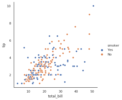
sns.set(style="white")
g = sns.relplot(x="total_bill", y="tip", hue="smoker", data=tips)
# styles = ['darkgrid', 'whitegrid', 'dark', 'white', 'ticks']
sns.set(style="ticks")
g = sns.relplot(x="total_bill", y="tip", hue="smoker", data=tips)

Overriding seaborn style to matplotlib
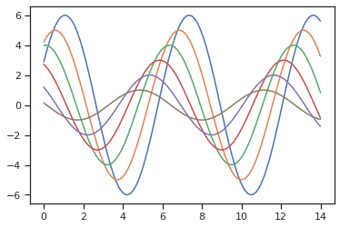
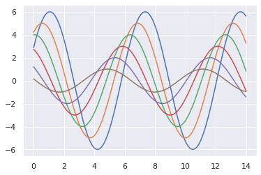
Seaborn 은 matplotlib 을 이용하는 패키지이기 때문에, style 설정이 matplotlib 에도 영향을 줍니다. 아래의 예시는 matplotlib 을 이용하여 주기와 진폭이 서로 다른 sin 함수들의 플랏입니다.
sns.set(style="ticks")

def sinplot(flip=1):
    g = plt.figure(figsize=(6,4))
    x = np.linspace(0, 14, 100)
    for i in range(1, 7):
        plt.plot(x, np.sin(x + i * .5) * (7 - i) * flip)
    return g

g = sinplot()
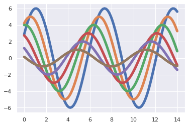
위 그림의 style 을 Seaborn 의 default 인 darkgrid 로 변경해봅니다.
sns.set()
g = sinplot()
혹은 font size 나 line width 와 같은 attributes 를 변경할 수도 있습니다. 가능한 attributes 는 matplotlib 의 문서를 참고합니다.
sns.set_context(font_scale=1.5, rc={"lines.linewidth": 5.0})
g = sinplot()
이러한 style 설정의 영향은 matplotlib 을 이용하는 Pandas 에도 미칩니다. DataFrame 의 plot 함수는 기본값으로 matplotlib 을 이용하기 때문에 seaborn 의 style 을 변경하면 설정이 반영됩니다.
sns.set(style="ticks")
g = tips.plot(x='total_bill', y='tip', kind='scatter')
sns.set(style="darkgrid")
g = tips.plot(x='total_bill', y='tip', kind='scatter')
Customized palette
Palette 는 style 이 이용하는 color codes 입니다. 이들은 RGB 의 값을 [0, 1] 사이로 표현한 tuple 의 list 로 표현됩니다. 현재 이용하는 palette 는 seaborn.color_palette() 함수를 통하여 확인할 수 있습니다.
sns.set(style="ticks")
sns.color_palette()
[(0.2980392156862745, 0.4470588235294118, 0.6901960784313725),
 (0.8666666666666667, 0.5176470588235295, 0.3215686274509804),
  ...
 (0.39215686274509803, 0.7098039215686275, 0.803921568627451)]
Palette 를 사용자의 선호대로 변경할 수 있습니다. 그런데 일반적으로 RGB 값을 위의 예시처럼 float vector 로 알고 있기 보다는 아래처럼, # 뒤에 세 개의 16진수로 RGB 를 표현하는 HTML color code 로 알고 있는 경우들이 많습니다. seaborn.color_palette() 함수는 HTML color code 를 float vector 로 변환해 줍니다. 이를 seaborn.set_palette() 에 입력하면 palette 가 변경됩니다.
from pprint import pprint

# from Bokeh Accent[5] colors
color_codes = ['#7fc97f', '#beaed4', '#fdc086', '#ffff99', '#386cb0']
colors = sns.color_palette(color_codes)
pprint(colors)

sns.set_palette(colors)
g = sns.relplot(x="total_bill", y="tip", hue="smoker", data=tips)
[(0.4980392156862745, 0.788235294117647, 0.4980392156862745),
 (0.7450980392156863, 0.6823529411764706, 0.8313725490196079),
 (0.9921568627450981, 0.7529411764705882, 0.5254901960784314),
 (1.0, 1.0, 0.6),
 (0.2196078431372549, 0.4235294117647059, 0.6901960784313725)]